Analysis of advertising across Morning Brew brands - Part 1
Observations of advertising in the Morning Brew newsletter.
💰️ Advertising in newsletters
You just started your newsletter. Maybe you work as an email marketer for a company. Or you're just curious about newsletters because you subscribe to dozens. Whatever the reason, and whatever brought you here, we hope to share some insights about advertising in newsletters.
It's a big topic, so what do we do with a big topic? Break it down.
Giphy.com
Let's start with a newsletter that helped bring newsletters into the limelight — Morning Brew — a free daily email newsletter to give you "need-to-know info in a way you didn’t know you needed,"
We thought it would be fun to start the journey with Morning Brew, since they've expanded into different newsletters, channels and more.
The first part in the series will highlight Morning Brew, the flagship and daily newsletter, and then proceed with other newsletters from Morning Brew. Date range we're observing, ~December-January 2023.
🔑 Key takeaways
1️⃣ Ads can be displayed natively or organically.
A native ad is typically an image, headline with some copy and maybe a CTA button. An organic ad or mention is often intertwined into a section of the newsletter with non-paid messaging.
This two-pronged approach might be because readers can more quickly identify a native ad in an email, so they may be more likely to scroll past it compared to a more organic mention or text-only message that is mixed in with non-sponsored messaging. Or maybe it's all viewed as space to put sponsored content. Feel free to share any thoughts below!
2️⃣ Placement can be anywhere. Ads can be found in the top section, the middle, the bottom. Above the fold, below the fold. Anywhere. Ad placement accounted for ~25-35% of the email in the observed emails.
3️⃣ Personalized experience. Sponsors may develop a custom landing page or messaging once the reader clicks the ad (Examples below).
1️⃣ What is a native ad? What is an organic ad?
These are two ways we've seen advertising or sponsored content displayed in an email newsletter. We've seen the approach of "Headline --> Image --> Copy --> Call-to-Action (CTA)". This tends to closely resemble other areas of the email, or how many newsletter sections are structured.
Example of a native ad
Morning Brew
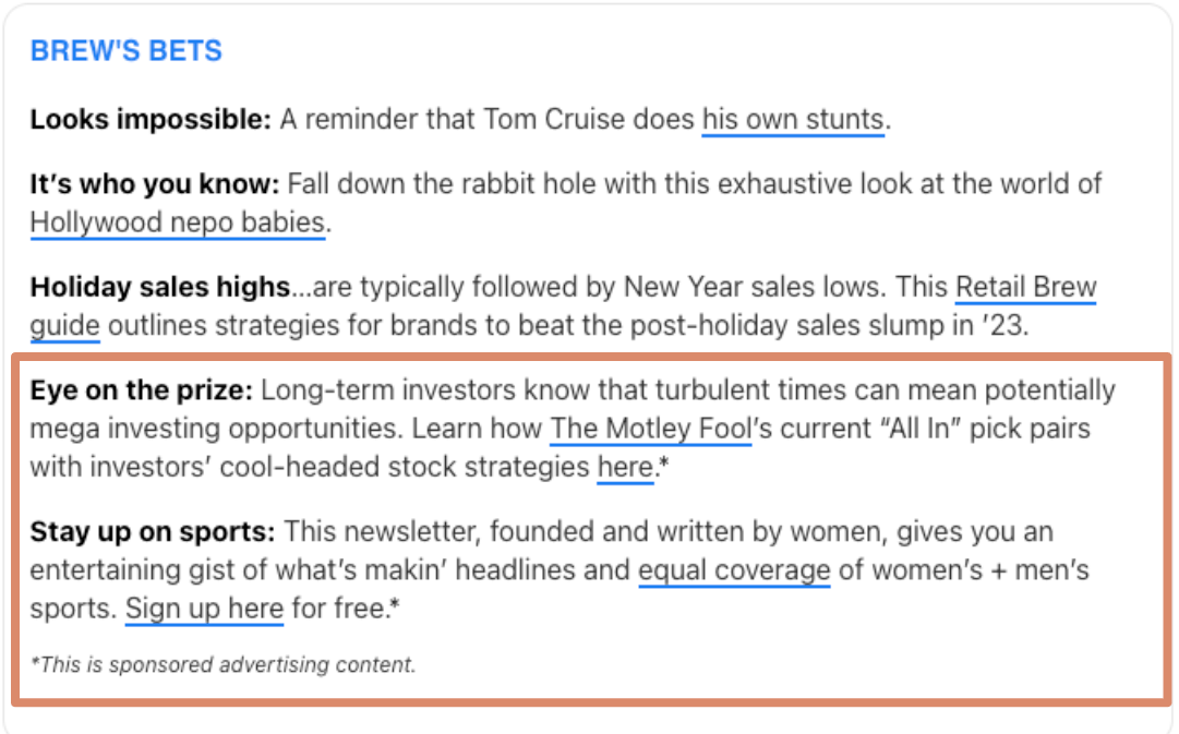
We've also seen the approach of "text-only". It tends to blend in more and can be harder to visually identify.
Example of an organic ad
Morning Brew
2️⃣ Placement can be anywhere, and it's not always obvious.
Ads or sponsored content is always evolving. When we read a newsletter or skim an email, are we thinking: “This is paid,” or “That’s an ad,” Maybe. Maybe not.
Giphy.com
Marketers tend to see strong engagement and high conversion rates from emails, and email is oftentimes the leading channel or has the highest ROI. This is a generalization, but it’s worth noting. Knowing that email is a strong channel it becomes a prime place for ads and sponsored content.
In an email, it may not be as apparent that it’s an ad. For example, sometimes sponsored content is in the voice of the writer. Does that blur editorial guidelines or diminish value from the writing? Maybe. Maybe not.
The content is nestled in with other links in the same format. Do we always notice the * asterisk denoting it is a “advertising” or “paid content”? Does that impact our decision to click or not? Maybe. Maybe not.
Sponsored content continues to evolve. From what imagery to select: Does it blend in with the newsletter's look and feel? Is it on brand for both the advertiser and the advertise-e? What about the copy? Can we make it an exclusive offer for the newsletter's readers? And as inboxes continue to be a place to reach potential customers, we'll continue to see more sponsored content and more strategies.
One strategy being: A personalized experience.
3️⃣ Personalized experience.
Personalization in email isn't new. Whether that's using or taking into account previous purchases, or setting up workflows and automations based on certain user traits. It can be as simple or as nuanced as you (and your tech stack) would like it to be.
The personalized experience can also be factored in when the newsletter is trying to decide what advertiser fits the readers and vice versa. This takes work on both parties. Have they surveyed their users? Have they done their own research? Or is it just a "cooking with feel" kind of vibe?
Either way, newsletters need to take into account their readers and what kind of sponsored content would best suit them, and same goes for the advertiser. They want their content reaching customers with the most potential.
Oftentimes, it's a conversation between the marketing department or people sending the newsletter, editorial and potential advertisers. Each stakeholder balances not overloading the newsletter with sponsored content that could inversely impact email marketing metrics (think lower Click Rates and high Unsubscribe Rates) along with trying to make money from advertisements.
Typically, an advertiser will try the placement out for a few sends and see how the ad performs. Meanwhile, the newsletter team will determine its impact on metrics like Click Rate and Unsubscribe Rate and evaluate from there. Since the space is somewhat new, not everyone knows what quantifies a "good" sponsorship placement.
Let's take a look at some examples of personalization:
Facet Wealth.
Vuori.
Future.
Facet Wealth
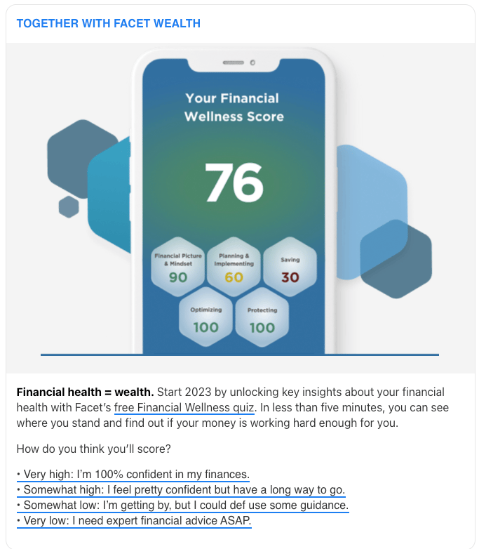
Facet Wealth ad in January 10 Morning Brew email
The Facet Wealth ad takes the native ad approach. We got an image, some copy… but wait a minute… you’re asking me to participate in a quiz… mmm… that’s engaging. But then you're also asking me how you think I'll score? That's right there in the email. I kind of want to know what other people replied with… gosh darn it I’ll click it.
... Andddddd there we go.
➕ This may have increased Click Rate for the email. This boosts engagement numbers, overall send reputation, etc.
➕ This may have boosted Click Rate specifically for sponsored content. This is important considering advertisers might be interested in these numbers if they're considering taking out a placement in your newsletter.
➕ For the advertiser, they may receive increased engagement proving the advertising spend was fruitful, maybe some customer insights and creatively differentiated their ad from other sponsored ads. They could’ve taken the standard path of image + copy + Call-to-Action (CTA), but they spiced it up by creating a quick quiz and getting the reader involved through a poll.
🤔 Interesting observation: The quiz was hosted on Facet Wealth. The poll was hosted on Morning Brew. Why not Facet Wealth? Maybe Facet Wealth didn’t want to build it on their end, maybe Morning Brew wanted to host it. Maybe Morning Brew's polling tool plays nicer with their Email Service Provider. Either way, Morning Brew featured “Together with Facet Wealth” on the landing page for the poll to reflect it was a part of the sponsorship.
It was a little confusing to have a Financial Wellness quiz (hosted on Facet Wealth) and then a poll asking: "How do you think you'll score?" A little bit of competing CTAs.
Also, they did not share the number of participants, but instead the percentage that chose that answer. It may be insightful for readers to know that in this example 37% of users responded with: “Very high: I’m 100% confident,” but was it statistically significant? Was the survey pool ~50 readers? Maybe ~10,000? We’re not sure. This can be beneficial both from Morning Brew’s perspective of providing percentages instead of number of clicks, or maybe Facet Wealth wanted it displayed that way. Who knows.
Vuori
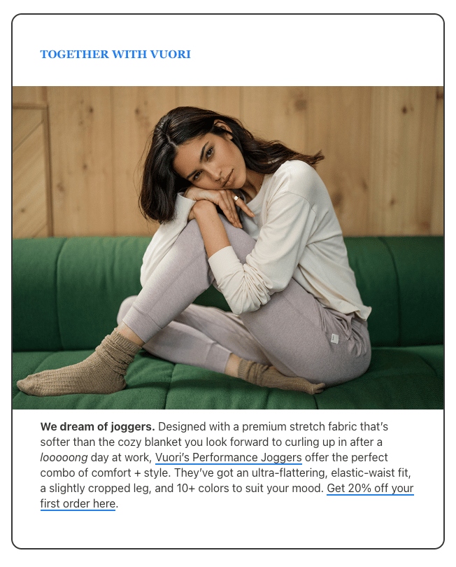
Vuori ad in January 8 Morning Brew email
Vuori also takes the native ad approach. The offer is 20% off your first order with no deadline. Nice. The copy isn’t super tailored, it seems somewhat boilerplate. Sure, there’s a little flair there with “curling up after a looooong day at work,” but again, may be towing that editorial // sponsored content line.
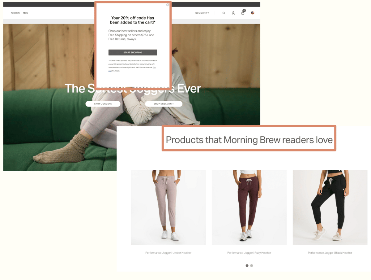
When you click the link, you’re taken to a Vuori landing page with “Products that Morning Brew readers love,” and a couple of product images. This brings an exclusivity factor specific to being a reader of Morning Brew, similar to the 20% off being unique to Morning Brew readers.
They also had a popup mentioning that the 20% code was added to the cart. This is convenient, and also prevents a promo code from circulating around the internet and being added to tools like Honey or RetailMeNot.
Future
Future ad in January 8 Morning Brew email
Future ad in January 10 Morning Brew email
Future went the organic route. The sponsored content was featured in the Brew’s Bets section of the email, headlined as “Sunday to-do list” which is unique to the Sunday send. Future took the subtle approach. They’re like, “Hey, we’re not like an ad-ad… we’re a cool ad”.
Giphy.com
Future is featured in the unique Sunday to-do list section as a one of the ✅’s: “Give it a go: Get paired with a Future coach for unlimited personal training based on your goals + schedule. Start a 1-month free trial – this month only.*”With the gentle reminder asterisk meaning: “This is sponsored advertising content."
Interesting. Someone might’ve clicked thinking it was like the other items in the section, something not advertised and from one of the writers. Or maybe it was clear it was advertising content, but it was nestled in nicely with a bunch of other quick hitting check marks so you don't notice. Maybe you gloss over this section every Sunday. Either way, these two approaches of displaying content natively and organically are interesting!
🧠 What have we learned?
Sponsored content continues to evolve through format and copywriting. What we would like readers to do: click a link, take a poll, reply to the email etc. and how it is displayed.
Maybe the organic mention is a reaction to the standard native advertising we've been noticing in newsletters. Readers are savvy, and are becoming more aware of ads in email. They're also all starting to look the same.
It's smart to enhance sponsored content with quizzes, polls, unique landing pages, exclusive deals for readers. Maybe the writer(s) takes the time to tweak the marketing copy and put it in their own voice making it seem like it’s coming from the writer(s) and less so the advertiser. This could potentially strengthen the likelihood of a reader to purchase if it reads like it's more from the writer(s) than the advertiser.
Is one method better than the other? No. Each advertiser and every reader are unique. What one newsletter does, no matter if they have X amount of subscribers like Morning Brew, doesn't mean it's producing great results. They could be testing things too! And even then, what produces great results for one company or newsletter is not indicative of it producing the same results for another company or newsletter.
I like that sponsors and newsletters are trying to mix it up a bit, but we’re still towing that editorial line, right?
But… it’s not The «INSERT CREDIBLE MEDIA ORGANIZATION». It’s Morning Brew? They're newsy, but don't have to deliver the news with a sense of neutralness or standard-setting journalistic integrity. And that makes it fun, and maybe slightly more enjoyable to read and ingest news and information.
What do you think? Feel free to reply to this email or send us an email and we may feature some comments from readers in the next newsletter!


